Difference between revisions of "Scheduler"
| Line 1: | Line 1: | ||
| − | {{UI Object Header}} | + | {{UI Object Header}} |
This object provides the user interface to the HSYCO's scheduler system. | This object provides the user interface to the HSYCO's scheduler system. | ||
Revision as of 18:02, 30 January 2014
This object provides the user interface to the HSYCO's scheduler system. The scheduler is a powerful function that allows you to define a set of calendar entries to schedule actions at the beginning and end of each time interval.
A normal scheduler rule is defined with a start date/time and an end date/time and is valid within the defined period, even across several days. A daily rule is instead defined to be valid between a start time and end time, on a single day or spanning several days. In addition to the validity dates, you can set a rule to be active only on specific week days. When the current time matches the date/time and week days, the default behavior is that the scheduler generates a TIMER <schedule name> = ON event and the corresponding userTimerEvent() Java callback — just like the (timer) object — and a TIMER <schedule name> = OFF event at the end of the period.
You can also define an interval rule, setting the on and off minutes. An interval rule will go on and off repeatedly during the date/time validity period. Each rule has a group. This group is used to generate the events, and is not unique, as you can define several rules under the same group. In this case the scheduler will evaluate the rules having the same group in the order they appear in the scheduler display, from top to bottom. When a rule matches the date/time validity period, the scheduler stops checking any following rules with the same group. So, rules on top have priority within the rules with the same group. Rules set to work in off mode are used as "blocking rules", because when they are valid they will not become active, and at the same time will prevent the scheduler from processing the following rules that could otherwise match.
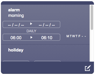
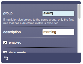
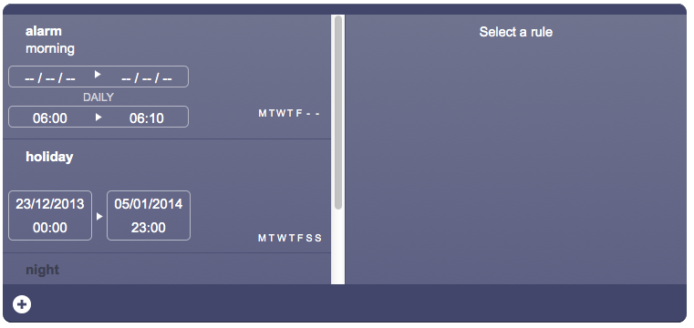
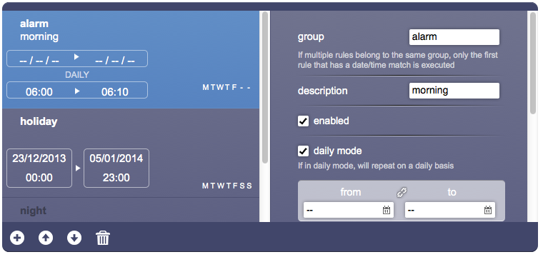
A scheduler has two graphical modes: compact and wide, depending on the object's width. A width of 750 pixels or more will toggle the wide mode that will display both the list of rules and the rule's details.
Here's a scheduler in compact mode, showing the list and the details:
Here's a scheduler in wide mode:
Parameters
- id: the object's ID, used by UISets
- position: the object's position. Use the pixels or rows and columns coordinates format
- size: panel's width, in pixels
- rule list mode: set to “edit” to enable the creation or deletion of individual schedules. Set to “noedit” to only allow editing of already defined schedules
- groups: optional, comma separated list of schedule group names that are shown in this object. If the list is not defined or set to "*", the object shows all groups
Syntax
(scheduler <position>; <width>; <height>; <mode>; <names>)
E.g.
(scheduler!myscheduler x3y256; 750; 350; edit;)
UI Attributes
Common attributes
| Name | Value | Description |
|---|---|---|
| pos | x<x>y<y> | Position specified as x/y coordinates. E.g. x-5y10 |
| r<r>c<c> | Position specified as row/column. E.g. r1c2 | |
| visible | true | Default. Show the object |
| false | Hide the object | |
| blink | true | slow | Blink the object at a slow speed |
| fast | Blink the object at a fast speed | |
| false | Stop the blinking | |
| opacity | 0.0 ... 1.0 | Object opacity from 0 (not visible) to 1 (fully visible) |


