Difference between revisions of "Slider"
Jump to navigation
Jump to search
| Line 40: | Line 40: | ||
|rowspan="4"|value | |rowspan="4"|value | ||
| − | | | + | |<min>-<max> |
| − | |Set the slider's value, from | + | |Set the slider's value, from <min> to <max> |
|- | |- | ||
|0%-100% | |0%-100% | ||
| Line 47: | Line 47: | ||
|- | |- | ||
|on | off | |on | off | ||
| − | |Set the slider's value to | + | |Set the slider's value to <max> (on) or <min> (off) |
|- | |- | ||
|0-n/n | |0-n/n | ||
|Set the slider's value, specifying a base. E.g. 64/256 sets the slider to 25% | |Set the slider's value, specifying a base. E.g. 64/256 sets the slider to 25% | ||
| + | |- | ||
| + | |||
| + | |range | ||
| + | |<min>,<max> | ||
| + | |Specify minimum and maximum values that the slider's value can assume. Default values are <min>,<max> | ||
|- | |- | ||
| Line 68: | Line 73: | ||
|rowspan="2"|inverse | |rowspan="2"|inverse | ||
|true | |true | ||
| − | |Inverts the slider's bar verse: on a slider object the cursor is at the top when the value is | + | |Inverts the slider's bar verse: on a slider object the cursor is at the top when the value is <min>, at the bottom when the value is <max> |
|- | |- | ||
|false | |false | ||
Revision as of 15:56, 6 June 2014
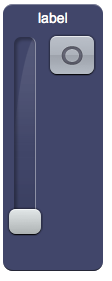
A slider object that sends requests to the server.
Using this object you can execute customized Java code or generate events for the EVENTS interpreter, like with the user object, passing the object's name and the selected value.
Three versions are available:
- slider: vertical slider with a label and an on/off button
- sliderv: minimal vertical slider
- sliderh: minimal horizontal slider
Parameters
- address: address passed to the Java callback method and event in EVENTS
- position: the object's position. Use the pixels or rows and columns coordinates format
- label: the text label on the button. Can contain HTML tags
Syntax
(slider!<id> <address>; <position>; <label>)

(sliderv!<id> <address>; <position>)

(sliderh!<id> <address>; <position>)
E.g.
(slider!myslider slider1; x10y20; Label)

(sliderv!myslider slider1; x10y20)

(sliderh!myslider slider1; x10y20)
UI Attributes
Common attributes
| Name | Value | Description |
|---|---|---|
| pos | x<x>y<y> | Position specified as x/y coordinates. E.g. x-5y10 |
| r<r>c<c> | Position specified as row/column. E.g. r1c2 | |
| visible | true | Default. Show the object |
| false | Hide the object | |
| blink | true | slow | Blink the object at a slow speed |
| fast | Blink the object at a fast speed | |
| false | Stop the blinking | |
| opacity | 0.0 ... 1.0 | Object opacity from 0 (not visible) to 1 (fully visible) |
Slider attributes
| Name | Value | Description |
|---|---|---|
| value | <min>-<max> | Set the slider's value, from <min> to <max> |
| 0%-100% | Set the slider's value, from 0% to 100% | |
| off | Set the slider's value to <max> (on) or <min> (off) | |
| 0-n/n | Set the slider's value, specifying a base. E.g. 64/256 sets the slider to 25% | |
| range | <min>,<max> | Specify minimum and maximum values that the slider's value can assume. Default values are <min>,<max> |
| bar | true | Show the value bar |
| false | Hide the value bar | |
| barcolor | CSS color | Set the value bar's color |
| inverse | true | Inverts the slider's bar verse: on a slider object the cursor is at the top when the value is <min>, at the bottom when the value is <max> |
| false | Default behaviour | |
| enabled | true | Field is enabled |
| false | Field is disabled |
A CSS color can be specified as
- hex value: #<rr><gg><bb> E.g. #FF1010
- color name: red, blue, white...
- as rgb: rgb(<r>,<g>,<b>) E.g. rgb(255,30,30)
- as rgba: rgba(<r>,<g>,<b>,<alpha>) E.g. rgba(255,30,30,0.5)
