Difference between revisions of "Slider"
Jump to navigation
Jump to search
| Line 4: | Line 4: | ||
Using this object you can execute customized Java code or generate events for the EVENTS interpreter, like with the [[user]] object, passing the object's name and the selected value. | Using this object you can execute customized Java code or generate events for the EVENTS interpreter, like with the [[user]] object, passing the object's name and the selected value. | ||
| + | Three versions are available: | ||
| + | * ''slider'': vertical slider with a label and an on/off button | ||
[[File:UI Object slider.png]] | [[File:UI Object slider.png]] | ||
| + | * ''sliderv'': minimal vertical slider | ||
| + | [[File:UI Object sliderv.png]] | ||
| + | * ''sliderh'': minimal horizontal slider | ||
| + | [[File:UI Object sliderh.png]] | ||
== Parameters == | == Parameters == | ||
| Line 12: | Line 18: | ||
== Syntax == | == Syntax == | ||
| − | (slider <name>; <position>; <label>) | + | (slider!id <name>; <position>; <label>) |
| + | |||
| + | (sliderv!id <name>; <position>) | ||
| + | |||
| + | (sliderh!id <name>; <position>) | ||
E.g. | E.g. | ||
(slider!myslider slider1; x10y20; Label) | (slider!myslider slider1; x10y20; Label) | ||
| + | |||
| + | (sliderv!myslider slider1; x10y20) | ||
| + | |||
| + | (sliderh!myslider slider1; x10y20) | ||
| + | |||
| + | == UI Attributes == | ||
| + | {{UI Object Attributes (Common)}} | ||
Revision as of 11:41, 27 January 2014
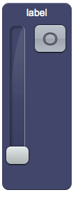
A slider object that sends requests to the server.
Using this object you can execute customized Java code or generate events for the EVENTS interpreter, like with the user object, passing the object's name and the selected value.
Three versions are available:
- slider: vertical slider with a label and an on/off button
- sliderv: minimal vertical slider
- sliderh: minimal horizontal slider
Parameters
- name: name passed to the Java callback method and event in EVENTS
- position: the object's position. Use the pixels or rows and columns coordinates format
- label: the text label on the button. Can contain HTML tags
Syntax
(slider!id <name>; <position>; <label>)

(sliderv!id <name>; <position>)

(sliderh!id <name>; <position>)
E.g.
(slider!myslider slider1; x10y20; Label)

(sliderv!myslider slider1; x10y20)

(sliderh!myslider slider1; x10y20)
UI Attributes
Common attributes
| Name | Value | Description |
|---|---|---|
| pos | x<x>y<y> | Position specified as x/y coordinates. E.g. x-5y10 |
| r<r>c<c> | Position specified as row/column. E.g. r1c2 | |
| visible | true | Default. Show the object |
| false | Hide the object | |
| blink | true | slow | Blink the object at a slow speed |
| fast | Blink the object at a fast speed | |
| false | Stop the blinking | |
| opacity | 0.0 ... 1.0 | Object opacity from 0 (not visible) to 1 (fully visible) |
| rotation | 0 ... 360 | Object rotation in degrees. Images are rotated around the center point, all other objects are rotated around the top left corner |
