
For a description and a complete list of UI Objects, see
UI Objects.
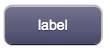
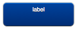
A button used to navigate to another page, a pop-up, or an external Web page.
It has several colors (depending on the skin) and four different sizes:


For a custom image version, see ImageLink.
Parameters
- id: the object's ID, used by UISets. Required
- position: the object's position. Use the pixels or rows and columns coordinates format
- color: the color of the button. It can assume any of the skin's color values (E.g. for the "blue" skin, the possible values are: b - blue; g - green; gr - gray; r - red; y - yellow; glass)
- page: the name of the destination page associated to the button. It is possible to specify an absolute or relative URL in the page parameter. The tag will work as an <A HREF> tag, loading the new page. If the loaded page is an HSYCO menu, the back link will show up in the menu page, to reload the referrer page
- label: the text label on the button. It can contain HTML tags
Syntax
(link[!<id>] <pos>; <color>; <page>; <label>)

(linkmini[!<id>] <pos>; <color>; <page>; <label>)

(linkmicro[!<id>] <pos>; <color>; <page>; <label>)

(dlink[!<id>] <pos>; <color>; <page>; <label>)
E.g.
(link!link1 x10y20; r; page1; Page 1)

(linkmini r0c1; glass; http://www.hsyco.com; hsyco)

(linkmicro x0y100; gr; /hsycohsyco/office; HSYCO Office)

(dlink!dlink1 x10y10; b; page1; Larger text<br>with <b>HTML</b> tags)
UI Attributes
Common attributes
| Name
|
Value
|
Description
|
| pos
|
x<x>y<y>
|
Position specified as x/y coordinates. E.g. x-5y10
|
| r<r>c<c>
|
Position specified as row/column. E.g. r1c2
|
| visible
|
true
|
Default. Show the object
|
| false
|
Hide the object
|
| blink
|
true | slow
|
Blink the object at a slow speed
|
| fast
|
Blink the object at a fast speed
|
| false
|
Stop the blinking
|
| opacity
|
0.0 ... 1.0
|
Object opacity from 0 (not visible) to 1 (fully visible)
|
| rotation
|
0 ... 360
|
Object rotation in degrees. Images are rotated around the center point, all other objects are rotated around the top left corner
|
Label attributes
| Name
|
Value
|
Description
|
| label
|
<string>
|
Label's text. Can contain HTML tags
|
| fontfamily
|
<family name>
|
A prioritized list of font family names
|
| fontsize
|
<size>
|
Font size in pixels. E.g. 15px
|
| fontcolor
|
<CSS color>
|
Font color
|
| fontstyle
|
normal
|
Normal font style, default
|
| italic
|
Italic font style
|
| oblique
|
Oblique font style
|
| fontweight
|
normal
|
Normal characters, default
|
| bold
|
Thick characters
|
| bolder
|
Thicker characters
|
| lighter
|
Lighter characters
|
| 100 ... 900
|
Defines from thin to thick characters. 400 is the same as normal, and 700 is the same as bold
|
Button attributes
| Name
|
Value
|
Description
|
| style
|
red,green,blue...
|
Set the button's style (color). Styles vary depending on the selected skin
|
| enabled
|
true
|
Default. Enable the button
|
| false
|
Disable the button
|

