Difference between revisions of "SelectPanel"
Jump to navigation
Jump to search
| (One intermediate revision by one other user not shown) | |||
| Line 21: | Line 21: | ||
(selectpanel!myselect r1c1; 220; 224; 1,2,3; one,two,three) | (selectpanel!myselect r1c1; 220; 224; 1,2,3; one,two,three) | ||
| − | + | {{UI Object Template}} | |
| − | |||
| − | |||
| − | |||
| − | |||
| − | |||
| − | |||
| − | |||
| − | |||
| − | |||
| − | |||
| − | |||
| − | |||
| − | |||
| − | |||
| − | |||
| − | |||
| − | |||
== UI Attributes == | == UI Attributes == | ||
| Line 52: | Line 35: | ||
|value | |value | ||
|string | |string | ||
| − | | | + | |Selected value |
|- | |- | ||
Latest revision as of 15:08, 8 August 2017
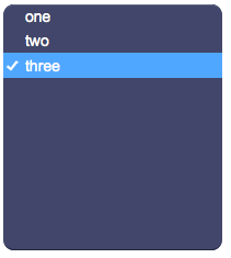
Select panel that allows the user to select a value from a list. Can be used with a submit button.
For a tutorial on using this object, see Working with Forms
Contents
Parameters
- id: the object's ID, used by UISets
- position: the object's position. Use the pixels or rows and columns coordinates format
- size: the panel's width and height
- values: comma-separated list of values. When selecting an item from the list, the corresponding value from this list is sent
- labels: comma-separated list of labels corresponding to the values. If missing, values will be shown instead
- css: optional. Defines the CSS style for the input field
- template: optional. Html template to be used for each item
Syntax
(selectpanel!<id> <position>; <width>; <height>; <values>; <labels>; <css>; <template>)
E.g.
(selectpanel!myselect r1c1; 220; 224; 1,2,3; one,two,three)
Template
The template is HTML code that is applied to every item. An item's label is split into parts using the pipe character. These parts are replaced inside the template's code to form the final item's source.
%<n> (with n starting from 1) is used to include each part of the item's label inside the HTML. To avoid the % symbol to be replaced, use % instead.
E.g. If the template is:
<table><tr><td>%1</td><td>%2</td></table>and the labels are:
a|one,b|two
the resulting items will have the following html code:
<table><tr><td>a</td><td>one</td></table>and
<table><tr><td>b</td><td>two</td></table>UI Attributes
Common attributes
| Name | Value | Description |
|---|---|---|
| pos | x<x>y<y> | Position specified as x/y coordinates. E.g. x-5y10 |
| visible | true | Default. Show the object |
| false | Hide the object | |
| blink | true | slow | Blink the object at a slow speed |
| fast | Blink the object at a fast speed | |
| false | Stop the blinking | |
| opacity | 0.0 ... 1.0 | Object opacity from 0 (not visible) to 1 (fully visible) |
| rotation | 0 ... 360 | Object rotation in degrees. Images are rotated around the center point, all other objects are rotated around the top left corner |
Field attributes
| Name | Value | Description |
|---|---|---|
| enabled | true | Field is enabled |
| false | Field is disabled | |
| autosend | true | Automatically sends the value on changes. It's the default behaviour when there are no submit objects on the page or in a parent container (if the field is inside a container). |
| false | Won't send the value on changes. It's the default behaviour when there's a submit object on the page or in a parent container. | |
| focus (deprecated, use page's focus attribute instead) | true | Focus the field. Only a single object should have this attribute at "true". |
| false | Reset focus | |
| rollback | true | Restores the previously saved value. |
| rollbackenabled | true | Automatically restores the previous value on an error (if the value isn't valid or the remote request resolved in an error). |
| false | Won't restore the value on errors. | |
| error | true | Manually shows an error feedback on the field (won't modify the current field value). |
| false | Hides the error visualization. |
SelectPanel attributes
| Name | Value | Description |
|---|---|---|
| value | string | Selected value |
| values | comma-separated list of strings | Select values |
| labels | comma-separated list of strings | Select labels |
| multi | true | Can select multiple values. The value sent to the server will be a comma-separated list of the selected values |
| false | Default behaviour: only a single value can be selected | |
| notnull | true | Value can't be null |
| false | Default. Value can be null | |
| width | number of pixels | Set the panel's width |
| height | number of pixels | Set the panel's height |
| panel | true | Show background panel |
| false | Hide background panel | |
| template | html code | Set the item's template |
