Difference between revisions of "Keypad"
Jump to navigation
Jump to search
| (One intermediate revision by the same user not shown) | |||
| Line 31: | Line 31: | ||
{{UI Object Attributes (Common)}} | {{UI Object Attributes (Common)}} | ||
{{UI Object Attributes (Field)}} | {{UI Object Attributes (Field)}} | ||
| − | === | + | ===Keypad attributes=== |
{| class="wikitable" | {| class="wikitable" | ||
!Name | !Name | ||
!Value | !Value | ||
!Description | !Description | ||
| + | |- | ||
| + | |||
| + | |value | ||
| + | |number | ||
| + | |Keypad value | ||
|- | |- | ||
Latest revision as of 11:10, 30 January 2014
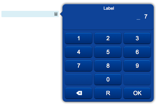
Keypad field that allows the user to input a numeric value. Clicking on the field will open a popup with a keypad panel. Can be used with a submit button.
The keypad performs range and number of digits validation of the input data.
Requires an ID.
For a tutorial on using this object, see Working with Forms
Contents
Parameters
- id: the object's ID, used by UISets
- position: the object's position. Use the pixels or rows and columns coordinates format
- min: the smallest accepted value
- max: the largest accepted value
- digits: the number of required digits; leave empty to accept a variable number of digits
- decimals: the maximum number of decimal digits; leave blank for integer numbers
- type: set to "input" for ordinary data; set to "password" to hide the digits
- label: the label shown at the top of the keypad panel
- css: optional. Defines the CSS style for the keypad field
Syntax
(keypad!id <pos>; <min>; <max>; <digits>; <decimals>; <type>; [<label>]; [<css>])
E.g.
(keypad!mykeypad x3y20; 0; 100; 2;; input; Label;)
UI Attributes
Common attributes
| Name | Value | Description |
|---|---|---|
| pos | x<x>y<y> | Position specified as x/y coordinates. E.g. x-5y10 |
| visible | true | Default. Show the object |
| false | Hide the object | |
| blink | true | slow | Blink the object at a slow speed |
| fast | Blink the object at a fast speed | |
| false | Stop the blinking | |
| opacity | 0.0 ... 1.0 | Object opacity from 0 (not visible) to 1 (fully visible) |
| rotation | 0 ... 360 | Object rotation in degrees. Images are rotated around the center point, all other objects are rotated around the top left corner |
Field attributes
| Name | Value | Description |
|---|---|---|
| enabled | true | Field is enabled |
| false | Field is disabled | |
| autosend | true | Automatically sends the value on changes. It's the default behaviour when there are no submit objects on the page or in a parent container (if the field is inside a container). |
| false | Won't send the value on changes. It's the default behaviour when there's a submit object on the page or in a parent container. | |
| focus (deprecated, use page's focus attribute instead) | true | Focus the field. Only a single object should have this attribute at "true". |
| false | Reset focus | |
| rollback | true | Restores the previously saved value. |
| rollbackenabled | true | Automatically restores the previous value on an error (if the value isn't valid or the remote request resolved in an error). |
| false | Won't restore the value on errors. | |
| error | true | Manually shows an error feedback on the field (won't modify the current field value). |
| false | Hides the error visualization. |
Keypad attributes
| Name | Value | Description |
|---|---|---|
| value | number | Keypad value |
| min | number | The smallest accepted value |
| max | number | The largest accepted value |
| digits | number | The number of required digits; leave empty to accept a variable number of digits |
| decimals | number | The maximum number of decimal digits; leave blank for integer numbers |
| ktype | input | Show the digits |
| password | Hide the digit | |
| label | string | The label shown at the top of the keypad panel |
