Difference between revisions of "Datalogger"
| (22 intermediate revisions by 2 users not shown) | |||
| Line 7: | Line 7: | ||
== Parameters == | == Parameters == | ||
| − | *'''id''': the object's ID, used by UISets. | + | *'''id''': the object's ID, used by UISets. Optional |
| − | *'''loggerID''': the datalogger ID (or multiple IDs) | + | *'''loggerID''': the datalogger ID (or comma-separated list of multiple IDs) |
*'''position''': the object's position. Use the pixels or rows and columns coordinates format | *'''position''': the object's position. Use the pixels or rows and columns coordinates format | ||
*'''size''': the chart's area's width and height | *'''size''': the chart's area's width and height | ||
| Line 77: | Line 77: | ||
The Datalogger object can be configured to show multiple dataloggers at once. | The Datalogger object can be configured to show multiple dataloggers at once. | ||
The '''loggerID''' parameter (or '''loggerid''' attribute) can contain a list of IDs of visible dataloggers. | The '''loggerID''' parameter (or '''loggerid''' attribute) can contain a list of IDs of visible dataloggers. | ||
| + | |||
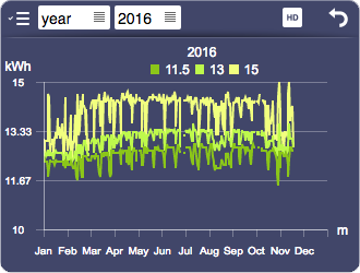
To give the user the option to select which dataloggers to show, the '''list''' attribute can be used. If a list is set, a drop down menu will appear in the top left of the toolbar (which is visible only if controls is set to toolbar). The '''names''' attribute allows to associate a name to each datalogger of the list (or each datalogger specified in loggerid, if the list is empty). | To give the user the option to select which dataloggers to show, the '''list''' attribute can be used. If a list is set, a drop down menu will appear in the top left of the toolbar (which is visible only if controls is set to toolbar). The '''names''' attribute allows to associate a name to each datalogger of the list (or each datalogger specified in loggerid, if the list is empty). | ||
[[File:UI Object datalogger.6.png]] | [[File:UI Object datalogger.6.png]] | ||
| + | |||
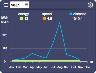
By default, all dataloggers are merged on the same scale. The '''multirange''' attribute allows each datalogger to have its own range, with its scale shown on the left of the chart. | By default, all dataloggers are merged on the same scale. The '''multirange''' attribute allows each datalogger to have its own range, with its scale shown on the left of the chart. | ||
[[File:UI Object datalogger.7.png]] | [[File:UI Object datalogger.7.png]] | ||
| + | |||
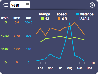
The '''rangegroups''' attribute allows dataloggers to be grouped to a common range. | The '''rangegroups''' attribute allows dataloggers to be grouped to a common range. | ||
| Line 90: | Line 93: | ||
[[File:UI Object datalogger.8.png]] | [[File:UI Object datalogger.8.png]] | ||
| − | The '''valuecolor[n]''' attribute (where n is an index starting from 1) | + | |
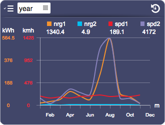
| + | The '''valuecolor[n]''' attribute (where n is an index starting from 1) changes the value color of a specific datalogger. | ||
In a datalogger with type range, the value is used for average, while colors for maximum and minimum are automatically calculated by changing the brightness. | In a datalogger with type range, the value is used for average, while colors for maximum and minimum are automatically calculated by changing the brightness. | ||
| Line 97: | Line 101: | ||
{{tip| }} To avoid strange behaviors when displaying multiple dataloggers, it's better to choose dataloggers that have common properties (such as origin, range, consolidation). | {{tip| }} To avoid strange behaviors when displaying multiple dataloggers, it's better to choose dataloggers that have common properties (such as origin, range, consolidation). | ||
| + | |||
| + | == Fullscreen == | ||
| + | The datalogger object has a fullscreen mode, that can be toggled by clicking the fullscreen icon, or by setting the value of the "fullscreen" UI Attribute. | ||
| + | |||
| + | The fullscreen mode will hide any other object and scale the datalogger to cover the whole screen. | ||
| + | |||
| + | If the URL query "fullwindow" is present, the datalogger will just expand inside the browser's window instead of actually going fullscreen. | ||
== UI Attributes == | == UI Attributes == | ||
| Line 125: | Line 136: | ||
|- | |- | ||
| − | |rowspan=" | + | |rowspan="5"|browserscale |
| + | |10y | ||
| + | |Set the live scale to 10 years | ||
| + | |- | ||
|year | |year | ||
|Set the browser scale to year | |Set the browser scale to year | ||
| Line 182: | Line 196: | ||
|- | |- | ||
| − | |rowspan="2"| | + | |csvseparator |
| + | |<character> | ||
| + | |Specifies a character used to separate columns in the generated csv file. Rows are separated with the newline character. | ||
| + | |- | ||
| + | |||
| + | |rowspan="2"|download | ||
|true | |true | ||
| − | | | + | |Display a button in browser mode that downloads a CSV file with the currently displayed data |
|- | |- | ||
|false | |false | ||
| − | | | + | |Default. No download icon |
|- | |- | ||
| Line 196: | Line 215: | ||
|false | |false | ||
|The axes are not visible (also notches and labels) | |The axes are not visible (also notches and labels) | ||
| + | |- | ||
| + | |||
| + | |rowspan="2"|fullscreen | ||
| + | |true | ||
| + | |Enables fullscreen mode | ||
| + | |- | ||
| + | |false | ||
| + | |Disables fullscreen mode | ||
|- | |- | ||
| Line 201: | Line 228: | ||
|<value> | |<value> | ||
|Name of a group. Dataloggers with the same group are synchronized (controlling one affects the others) | |Name of a group. Dataloggers with the same group are synchronized (controlling one affects the others) | ||
| + | |- | ||
| + | |||
| + | |rowspan="3"|hd | ||
| + | |true | ||
| + | |Enables HD | ||
| + | |- | ||
| + | |false | ||
| + | |Disables HD | ||
| + | |- | ||
| + | |toggle | ||
| + | |Shows an HD icon that lets the user toggle HD on and off | ||
|- | |- | ||
| Line 245: | Line 283: | ||
|- | |- | ||
| − | |rowspan=" | + | |rowspan="4"|mode |
|live | |live | ||
|Live mode | |Live mode | ||
| Line 251: | Line 289: | ||
|browser | |browser | ||
|Browser mode | |Browser mode | ||
| + | |- | ||
| + | |liveonly | ||
| + | |Locks the interface in live mode. It will hide the browser/live button on the UI. | ||
| + | |- | ||
| + | |browseronly | ||
| + | |Locks the interface in browser mode. It will hide the browser/live button on the UI. | ||
|- | |- | ||
| Line 258: | Line 302: | ||
|- | |- | ||
|false | |false | ||
| − | |Show a single chart | + | |Show a single chart in live mode, based on the selected scale |
|- | |- | ||
| Line 272: | Line 316: | ||
|names | |names | ||
|<comma-separated list of values> | |<comma-separated list of values> | ||
| − | | | + | |Sets the dataloggers names (relative to the list attribute or, if list is empty, the loggerid attribute), displayed in the legend, list popup and csv header |
|- | |- | ||
| Line 282: | Line 326: | ||
|notches | |notches | ||
|<value> | |<value> | ||
| − | |Number of notches on the | + | |Number of notches on the y-axis |
| + | |- | ||
| + | |||
| + | |rowspan="2"|panel | ||
| + | |true | ||
| + | |Show background panel | ||
| + | |- | ||
| + | |false | ||
| + | |Hide background panel | ||
|- | |- | ||
| Line 339: | Line 391: | ||
|hour | |hour | ||
|Set the live scale to hour | |Set the live scale to hour | ||
| + | |- | ||
| + | |||
| + | |refreshinterval | ||
| + | |<number> | ||
| + | |Specifies the live refresh interval in seconds. Default is 5 | ||
|- | |- | ||
| Line 398: | Line 455: | ||
|valuecolor[n] | |valuecolor[n] | ||
|<CSS color> | |<CSS color> | ||
| − | |Available only | + | |Available only with multiple dataloggers. Specifies the value color of the datalogger with index n (starting from 1). Accepted color formats: rgb and hex. |
| + | |- | ||
| + | |||
| + | |rowspan="2"|valueclickenabled | ||
| + | |true | ||
| + | |Default. Clicking on a value in browser mode will show the details of the next scale, if available. | ||
| + | |- | ||
| + | |false | ||
| + | |Clicking on a value to show the details is disabled | ||
|- | |- | ||
Latest revision as of 09:46, 7 September 2020
Works in combination with the data logger function to present a collection of data using time-based statistical charts. This object automatically adapts the graphical layout and size of the charts based on the overall object's size. The default presentation can be customized using several optional attributes. A datalogger can have a browser mode (if available server-side) for consulting past data. If a datalogger in browser mode isn't visible for more than a minute, it automatically resets to live mode.
Contents
Parameters
- id: the object's ID, used by UISets. Optional
- loggerID: the datalogger ID (or comma-separated list of multiple IDs)
- position: the object's position. Use the pixels or rows and columns coordinates format
- size: the chart's area's width and height
- unit: list of values axis labels. If the datalogger has slots, one unit for each slot. If there are multiple datalogger ids, one unit for each datalogger
- attributes: list of UI attribute names and values defining the chart's aspect and data. Setting this parameter is the same as setting each UI attribute with a UISet
Syntax
(datalogger[!<id>] <loggerID>; <pos>; <width>; <height>; <label>; <attributes>)
E.g.
(datalogger!datalogger1 edl; x80y60; 820; 500; kWh; controls=toolbar)
Types
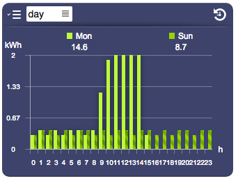
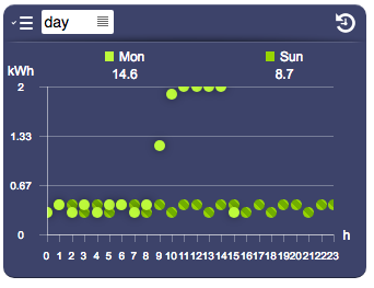
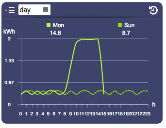
There are 5 different options to display data, which correspond to five possible values of the type attribute.
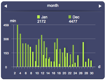
| type="bars" |
|
| type="points" |
|
| type="line" |

|
| type="spline" |
|
Pie
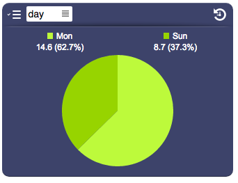
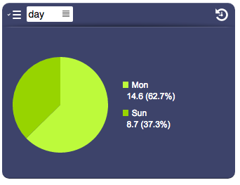
The pie type is particularly useful to compare multiple dataloggers.
The optional pielegendposition attribute determines the legend position relative to the pie chart.
| type="pie" |
|
| type="pie" (with pielegendposition="right") |
|
HD
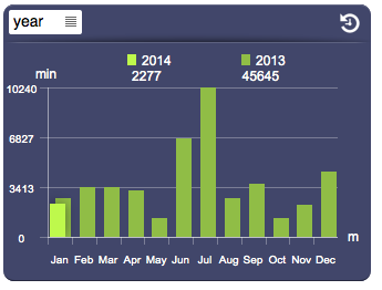
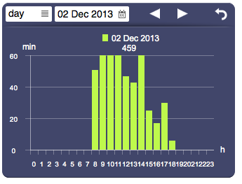
In browser mode, it is possible to display a high definition version of the current resolution, which selects and displays values from the next resolution available. For example when HD is active, the "month" resolution will display all the data from the "day" resolution, so it will show 744 (31*24) values instead of 31. HD is displayed only when available (if the next resolution data is available and not consolidated).
HD is controlled by the hd attribute, which can be either "true"/"false" or "toggle" which will show an icon and let the user control it.
Multiple Dataloggers
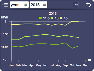
The Datalogger object can be configured to show multiple dataloggers at once. The loggerID parameter (or loggerid attribute) can contain a list of IDs of visible dataloggers.
To give the user the option to select which dataloggers to show, the list attribute can be used. If a list is set, a drop down menu will appear in the top left of the toolbar (which is visible only if controls is set to toolbar). The names attribute allows to associate a name to each datalogger of the list (or each datalogger specified in loggerid, if the list is empty).
By default, all dataloggers are merged on the same scale. The multirange attribute allows each datalogger to have its own range, with its scale shown on the left of the chart.
The rangegroups attribute allows dataloggers to be grouped to a common range.
The valuecolor[n] attribute (where n is an index starting from 1) changes the value color of a specific datalogger.
In a datalogger with type range, the value is used for average, while colors for maximum and minimum are automatically calculated by changing the brightness. Use only colors in rgb or hex formats.
![]() To avoid strange behaviors when displaying multiple dataloggers, it's better to choose dataloggers that have common properties (such as origin, range, consolidation).
To avoid strange behaviors when displaying multiple dataloggers, it's better to choose dataloggers that have common properties (such as origin, range, consolidation).
Fullscreen
The datalogger object has a fullscreen mode, that can be toggled by clicking the fullscreen icon, or by setting the value of the "fullscreen" UI Attribute.
The fullscreen mode will hide any other object and scale the datalogger to cover the whole screen.
If the URL query "fullwindow" is present, the datalogger will just expand inside the browser's window instead of actually going fullscreen.
UI Attributes
Common attributes
| Name | Value | Description |
|---|---|---|
| pos | x<x>y<y> | Position specified as x/y coordinates. E.g. x-5y10 |
| visible | true | Default. Show the object |
| false | Hide the object | |
| blink | true | slow | Blink the object at a slow speed |
| fast | Blink the object at a fast speed | |
| false | Stop the blinking | |
| opacity | 0.0 ... 1.0 | Object opacity from 0 (not visible) to 1 (fully visible) |
| rotation | 0 ... 360 | Object rotation in degrees. Images are rotated around the center point, all other objects are rotated around the top left corner |
Datalogger attributes
| Name | Value | Description |
|---|---|---|
| avgvalues | true | Show average values, if in range mode |
| false | Hide average values | |
| axiscolor | <CSS color> | Axis color |
| browserdate | date and time, in the "yyyymmddhh" format | Set the browser date and time. These formats will also be accepted: "yyyy", "yyyymm", "yyyymmdd" |
| browserscale | 10y | Set the live scale to 10 years |
| year | Set the browser scale to year | |
| month | Set the browser scale to month | |
| day | Set the browser scale to day | |
| hour | Set the browser scale to hour | |
| byday | true | Show daily data (hours) |
| false | Hide daily data | |
| byhour | true | Show hourly data (minutes) |
| false | Hide hourly data | |
| byminute | true | Show data by minute (seconds) |
| false | Hide data by minute | |
| bymonth | true | Show monthly data (days) |
| false | Hide monthly data | |
| controls | tabs | Show tabs on live mode for scale and slots |
| toolbar | Show a toolbar to control live and browser modes | |
| none | Don't show any controls | |
| csvseparator | <character> | Specifies a character used to separate columns in the generated csv file. Rows are separated with the newline character. |
| download | true | Display a button in browser mode that downloads a CSV file with the currently displayed data |
| false | Default. No download icon | |
| drawaxis | true | Default. The axes are visible (also notches and labels) |
| false | The axes are not visible (also notches and labels) | |
| fullscreen | true | Enables fullscreen mode |
| false | Disables fullscreen mode | |
| group | <value> | Name of a group. Dataloggers with the same group are synchronized (controlling one affects the others) |
| hd | true | Enables HD |
| false | Disables HD | |
| toggle | Shows an HD icon that lets the user toggle HD on and off | |
| labelcolor | <CSS color> | Color of the axis and bars labels |
| legend | true | Show all legends |
| false | Hide legends | |
| <comma-separated list of values> | List of legends (min, avg, max) to show | |
| list | <comma-separated list of datalogger IDs> | List of IDs of dataloggers selectable by the user. Shows an icon in the control bar that displays the list |
| loggerid | <comma-separated list of datalogger IDs> | List of IDs, to change it dynamically |
| maxvalues | true | Show maximum values, if in range mode |
| false | Hide maximum values | |
| minvalues | true | Show minimum values, if in range mode |
| false | Hide minimum values | |
| mode | live | Live mode |
| browser | Browser mode | |
| liveonly | Locks the interface in live mode. It will hide the browser/live button on the UI. | |
| browseronly | Locks the interface in browser mode. It will hide the browser/live button on the UI. | |
| multichart | true | Show multiple charts on live mode |
| false | Show a single chart in live mode, based on the selected scale | |
| multirange | true | For multiple datalogger ids only. Show multiple ranges for each datalogger id: each chart has multiple value axes. |
| false | Default. Single range for each datalogger | |
| names | <comma-separated list of values> | Sets the dataloggers names (relative to the list attribute or, if list is empty, the loggerid attribute), displayed in the legend, list popup and csv header |
| notchcolor | <CSS color> | Color of the axis notches |
| notches | <value> | Number of notches on the y-axis |
| panel | true | Show background panel |
| false | Hide background panel | |
| pastperiod | true | Show past period (only available for single datalogger id) |
| false | Hide past period | |
| pastvaluecolor | <CSS color> | A color that applies to all past values |
| <CSS color>,<CSS color>,<CSS color> | Colors that apply respectively to minimum, average and maximum past values | |
| pielegendposition | top | Default value. Applies to "pie" type, shows the legend on the top of the pie chart |
| right | Applies to "pie" type, shows the legend on the right of the pie chart | |
| pointsize | number of pixels | Point size (use for the points chart type) |
| presentvaluecolor | <CSS color> | A color that applies to all present values |
| <CSS color>,<CSS color>,<CSS color> | Colors that apply respectively to minimum, average and maximum present values | |
| rangegroups | <comma-separated list of values> | List of group names, one for each datalogger id (specified in list or in loggerid, if the list is empty). Dataloggers with the same group name are grouped together in a single range. |
| scale | year | Set the live scale to year |
| month | Set the live scale to month | |
| day | Set the live scale to day | |
| hour | Set the live scale to hour | |
| refreshinterval | <number> | Specifies the live refresh interval in seconds. Default is 5 |
| slot | <number> | Show a specific slot, from 0 to the number of slots-1 |
| stroke | number of pixel | Pixel size of the stroke that applies to line and spline chart's types |
| thresholdcolor | <CSS color> | Color of threshold lines. Not supported with multiple dataloggers with different scales/units. |
| thresholdcolors | <comma-separated list of CSS colors> | List of colors of threshold lines, one value each line. Not supported with multiple dataloggers with different scales/units. |
| thresholds | <comma-separated list of values> | List of values at which to display a line (threshold). Not supported with multiple dataloggers with different scales/units. |
| totals | true | Show totals |
| false | Hide totals | |
| type | bars | Draw bars |
| points | Draws points | |
| line | Draws a line connecting the values | |
| spline | Draws a spline connecting the values | |
| pie | Draws a pie chart, each slice representing a datalogger (if multiple dataloggers are visible), or past/present values. Percentage is shown in the legend | |
| units | <comma-separated list of values> | Units to display on the top left of each chart. If the datalogger has slots, one unit for each slot. If there are multiple datalogger ids, one unit for each datalogger |
| valuecolor[n] | <CSS color> | Available only with multiple dataloggers. Specifies the value color of the datalogger with index n (starting from 1). Accepted color formats: rgb and hex. |
| valueclickenabled | true | Default. Clicking on a value in browser mode will show the details of the next scale, if available. |
| false | Clicking on a value to show the details is disabled | |
| valuelabelcolor | <CSS color> | Value label's color |
| valuelabeltype | inside | Value labels are shown inside (if "type" is bars, points or gauge) or over (if "type" is line or spline) |
| outside | Value labels are shown above or below | |
| popup | Value labels are shown on mouseover, or on touch (if on a touch-enabled device) |
- hex value: #<rr><gg><bb> E.g. #FF1010
- color name: red, blue, white...
- as rgb: rgb(<r>,<g>,<b>) E.g. rgb(255,30,30)
- as rgba: rgba(<r>,<g>,<b>,<alpha>) E.g. rgba(255,30,30,0.5)
