Difference between revisions of "Time"
Jump to navigation
Jump to search
| (One intermediate revision by one other user not shown) | |||
| Line 31: | Line 31: | ||
|value | |value | ||
| − | | | + | |time in the "hhmm" format |
| − | | | + | |Time value |
|- | |- | ||
| Line 45: | Line 45: | ||
|step | |step | ||
|number | |number | ||
| − | |Amount of minutes time is divided into. E.g. A step value of "30" will only | + | |Amount of minutes time is divided into. E.g. A step value of "30" will only allow "00" or "30" as minutes. |
| + | A step value of "60" will only accept full hours. With step "60", a fixed value for minutes can be added as "60:<minutes>". E.g. "60:15" will lock minutes to 15. | ||
|- | |- | ||
|} | |} | ||
Latest revision as of 19:01, 19 December 2019
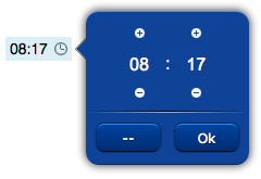
Time field that allows the user to input a time. Clicking on the field will open a popup with a time panel. Can be used with a submit button.
Requires an ID.
For a tutorial on using this object, see Working with Forms
Contents
Parameters
- id: the object's ID, used by UISets
- position: the object's position. Use the pixels or rows and columns coordinates format
- css: optional. Defines the CSS style for the date field
Syntax
(time!id <position>; [<css>])
E.g.
(time!mytime x3y20; width:55px)
UI Attributes
Common attributes
| Name | Value | Description |
|---|---|---|
| pos | x<x>y<y> | Position specified as x/y coordinates. E.g. x-5y10 |
| visible | true | Default. Show the object |
| false | Hide the object | |
| blink | true | slow | Blink the object at a slow speed |
| fast | Blink the object at a fast speed | |
| false | Stop the blinking | |
| opacity | 0.0 ... 1.0 | Object opacity from 0 (not visible) to 1 (fully visible) |
| rotation | 0 ... 360 | Object rotation in degrees. Images are rotated around the center point, all other objects are rotated around the top left corner |
Field attributes
| Name | Value | Description |
|---|---|---|
| enabled | true | Field is enabled |
| false | Field is disabled | |
| autosend | true | Automatically sends the value on changes. It's the default behaviour when there are no submit objects on the page or in a parent container (if the field is inside a container). |
| false | Won't send the value on changes. It's the default behaviour when there's a submit object on the page or in a parent container. | |
| focus (deprecated, use page's focus attribute instead) | true | Focus the field. Only a single object should have this attribute at "true". |
| false | Reset focus | |
| rollback | true | Restores the previously saved value. |
| rollbackenabled | true | Automatically restores the previous value on an error (if the value isn't valid or the remote request resolved in an error). |
| false | Won't restore the value on errors. | |
| error | true | Manually shows an error feedback on the field (won't modify the current field value). |
| false | Hides the error visualization. |
Input attributes
| Name | Value | Description |
|---|---|---|
| value | time in the "hhmm" format | Time value |
| notnull | true | Value can't be null |
| false | Default. Value can be null | |
| step | number | Amount of minutes time is divided into. E.g. A step value of "30" will only allow "00" or "30" as minutes.
A step value of "60" will only accept full hours. With step "60", a fixed value for minutes can be added as "60:<minutes>". E.g. "60:15" will lock minutes to 15. |
