Difference between revisions of "Chart"
Jump to navigation
Jump to search
(Created page with "Category:UI Objects") |
|||
| (21 intermediate revisions by 2 users not shown) | |||
| Line 1: | Line 1: | ||
| − | [[ | + | {{UI Object Header}} |
| + | Draws a chart. Its appearance and data are set with [[#Chart_attributes|UI Attributes]]. | ||
| + | More than one set of values can be specified. | ||
| + | |||
| + | [[File:UI Object chart.png]] | ||
| + | |||
| + | == Parameters == | ||
| + | *'''id''': the object's ID, used by UISets. Required | ||
| + | *'''position''': the object's position. Use the pixels or rows and columns coordinates format | ||
| + | *'''size''': the chart's area's width and height | ||
| + | *'''attributes''': list of UI attribute ids and values defining the chart's aspect and data. Setting this parameter is the same as setting each UI attribute with a UISet | ||
| + | |||
| + | == Chart types == | ||
| + | |||
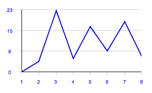
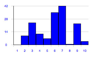
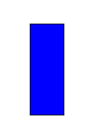
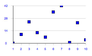
| + | The type attributes defines the way the values are displayed. | ||
| + | |||
| + | {| class="wikitable" | ||
| + | !Type | ||
| + | !Result | ||
| + | !Description | ||
| + | |- | ||
| + | |||
| + | |bars | ||
| + | |[[File:UI Object chart bars.jpg]] | ||
| + | |Draw bars | ||
| + | |- | ||
| + | |gauge | ||
| + | |[[File:UI Object chart gauge.jpg]] | ||
| + | |Draw a gauge, for charts with a single value. Use with the "value" attribute | ||
| + | |- | ||
| + | |points | ||
| + | |[[File:UI Object chart points.jpg]] | ||
| + | |Draws points | ||
| + | |- | ||
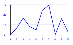
| + | |line | ||
| + | |[[File:UI Object chart line.jpg]] | ||
| + | |Draws a line connecting the values | ||
| + | |- | ||
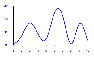
| + | |spline | ||
| + | |[[File:UI Object chart spline.jpg]] | ||
| + | |Draws a spline connecting the values | ||
| + | |- | ||
| + | |||
| + | |} | ||
| + | |||
| + | == Syntax == | ||
| + | (chart!<id> <address>; <position>; <width>; <height>; <attributes>) | ||
| + | E.g. | ||
| + | (chart!chart1 x3y187; 312; 180; (type=line; values=0,10,24,12,7,35,42,1,23,4)) | ||
| + | |||
| + | == UI Attributes == | ||
| + | {{UI Object Attributes (Common)}} | ||
| + | === Chart attributes === | ||
| + | {| class="wikitable" | ||
| + | !Name | ||
| + | !Value | ||
| + | !Description | ||
| + | |- | ||
| + | |rowspan="5"|type | ||
| + | |bars | ||
| + | |Draw bars | ||
| + | |- | ||
| + | |gauge | ||
| + | |Draw a gauge, for charts with a single value. Use with the "value" attribute | ||
| + | |- | ||
| + | |points | ||
| + | |Draws points | ||
| + | |- | ||
| + | |line | ||
| + | |Draws a line connecting the values | ||
| + | |- | ||
| + | |spline | ||
| + | |Draws a spline connecting the values | ||
| + | |- | ||
| + | |||
| + | |rowspan="2"|orientation | ||
| + | |vertical | ||
| + | |Default value. Draws a vertical chart | ||
| + | |- | ||
| + | |horizontal | ||
| + | |Draws an horizontal chart | ||
| + | |- | ||
| + | |||
| + | |value | ||
| + | |single value | ||
| + | |Value to be drawn. To be used when "type" is gauge | ||
| + | |- | ||
| + | |||
| + | |colspan="2"|value[n] | ||
| + | |Same as "value", but applies to a specific set of values | ||
| + | |- | ||
| + | |||
| + | |rowspan="2"|values | ||
| + | |comma-separated list of values | ||
| + | |Values to be drawn. E.g. 2,3,1.2,4 | ||
| + | |- | ||
| + | |comma-separated list of arrays | ||
| + | |Sets of values to be drawn. E.g. [2,3,1.2,4],[4,1,0,0.2] | ||
| + | |- | ||
| + | |||
| + | |colspan="2"|values[n] | ||
| + | |Same as "values", but applies to a specific set of values | ||
| + | |- | ||
| + | |||
| + | |valuerange | ||
| + | |[min],[max] | ||
| + | |Range of values displayed. E.g. -2,10 | ||
| + | |- | ||
| + | |||
| + | |rowspan="3"|axislabels | ||
| + | |auto | ||
| + | |Default. Labels on the x axis (if vertical) or y axis (if horizontal) will go from 1 to the total number of values. | ||
| + | |- | ||
| + | |none | ||
| + | |No label is shown on the x axis (if vertical) or y axis (if horizontal) | ||
| + | |- | ||
| + | |comma-separated list of values | ||
| + | |Custom labels on the x axis (if vertical) or y axis (if horizontal) | ||
| + | |- | ||
| + | |||
| + | |rowspan="3"|valuelabeltype | ||
| + | |inside | ||
| + | |Value labels are shown inside (if "type" is bars, points or gauge) or over (if "type" is line or spline) | ||
| + | |- | ||
| + | |outside | ||
| + | |Value labels are shown above or below | ||
| + | |- | ||
| + | |popup | ||
| + | |Value labels are shown on mouseover, or on touch (if on a touch-enabled device) | ||
| + | |- | ||
| + | |||
| + | |valuelabelcolor | ||
| + | |CSS color | ||
| + | |Color of the value labels font | ||
| + | |- | ||
| + | |||
| + | |valuelabels | ||
| + | |comma-separated list of values | ||
| + | |Custom values to show in value labels | ||
| + | |- | ||
| + | |||
| + | |colspan="2"|valuelabels[n] | ||
| + | |Same as "valuelabels", but applies to a specific set of values | ||
| + | |- | ||
| + | |||
| + | |spacing | ||
| + | |0-100 | ||
| + | |Percentage of spacing between bars or points | ||
| + | |- | ||
| + | |||
| + | |colspan="2"|spacing[n] | ||
| + | |Same as "spacing", but applies to a specific set of values | ||
| + | |- | ||
| + | |||
| + | |offset[n] | ||
| + | |percentage | ||
| + | |Percentage of value offset. Used to shift a specific set on the x axis if vertical, or on the y axis if horizontal. Used to show background sets. E.g. "offset[0]=-20; offset[1]=20" | ||
| + | |- | ||
| + | |||
| + | |rowspan="2"|drawaxis | ||
| + | |true | ||
| + | |Default. The axes are visible (also notches and labels) | ||
| + | |- | ||
| + | |false | ||
| + | |The axes are not visible (also notches and labels) | ||
| + | |- | ||
| + | |||
| + | |axisoffset | ||
| + | |percentage | ||
| + | |The axis offset (y if vertical, x if horizontal) expressed as percentage or as the value series index. E.g. "50%" or "3" | ||
| + | |- | ||
| + | |||
| + | |origin | ||
| + | |value | ||
| + | |Moves the origin to a value different from 0 ( e.g. origin=3.2 ) | ||
| + | |- | ||
| + | |||
| + | |notches | ||
| + | |value | ||
| + | |Number of notches on the x-axis (for vertical charts) or on the y-axis (for horizontal charts) | ||
| + | |- | ||
| + | |||
| + | |pointsize | ||
| + | |number of pixels | ||
| + | |Point size (use for the points chart type) | ||
| + | |- | ||
| + | |||
| + | |bgcolor | ||
| + | |CSS color | ||
| + | |Background color | ||
| + | |- | ||
| + | |||
| + | |valuecolor | ||
| + | |CSS color | ||
| + | |A color that applies to all values | ||
| + | |- | ||
| + | |||
| + | |colspan="2"|valuecolor[n] | ||
| + | |Same as "valuecolor", but applies to a specific set of values | ||
| + | |- | ||
| + | |||
| + | |valuecolors | ||
| + | |comma-separated list of CSS colors | ||
| + | |List of colors, one for each data point in values | ||
| + | |- | ||
| + | |||
| + | |colspan="2"|valuecolors[n] | ||
| + | |Same as "valuecolors", but applies to a specific set of values | ||
| + | |- | ||
| + | |||
| + | |rowspan="2"|barborder | ||
| + | |true | ||
| + | |Show bars/points border | ||
| + | |- | ||
| + | |false | ||
| + | |hide bars/points border | ||
| + | |- | ||
| + | |||
| + | |axiscolor | ||
| + | |CSS color | ||
| + | |Axis color | ||
| + | |- | ||
| + | |||
| + | |notchcolor | ||
| + | |CSS color | ||
| + | |Color of the axis notches | ||
| + | |- | ||
| + | |||
| + | |labelcolor | ||
| + | |CSS color | ||
| + | |Color of the axis and bars labels | ||
| + | |- | ||
| + | |||
| + | |thresholds | ||
| + | |Comma-separated list of values | ||
| + | |List of values at which to display a line (threshold) | ||
| + | |- | ||
| + | |||
| + | |thresholdcolor | ||
| + | |CSS color | ||
| + | |Color of threshold lines | ||
| + | |- | ||
| + | |||
| + | |thresholdcolors | ||
| + | |comma-separated list of CSS colors | ||
| + | |List of colors of threshold lines, one value each line | ||
| + | |- | ||
| + | |||
| + | |stroke | ||
| + | |number of pixel | ||
| + | |Pixel size of the stroke that applies to line and spline chart's types | ||
| + | |- | ||
| + | |||
| + | |colspan="2"|stroke[n] | ||
| + | |Same as "colspan", but applies to a specific set of values | ||
| + | |- | ||
| + | |||
| + | |} | ||
| + | |||
| + | {{Note:CSS Color}} | ||
Latest revision as of 12:21, 10 January 2017
Draws a chart. Its appearance and data are set with UI Attributes. More than one set of values can be specified.
Contents
Parameters
- id: the object's ID, used by UISets. Required
- position: the object's position. Use the pixels or rows and columns coordinates format
- size: the chart's area's width and height
- attributes: list of UI attribute ids and values defining the chart's aspect and data. Setting this parameter is the same as setting each UI attribute with a UISet
Chart types
The type attributes defines the way the values are displayed.
Syntax
(chart!<id> <address>; <position>; <width>; <height>; <attributes>)
E.g.
(chart!chart1 x3y187; 312; 180; (type=line; values=0,10,24,12,7,35,42,1,23,4))
UI Attributes
Common attributes
| Name | Value | Description |
|---|---|---|
| pos | x<x>y<y> | Position specified as x/y coordinates. E.g. x-5y10 |
| visible | true | Default. Show the object |
| false | Hide the object | |
| blink | true | slow | Blink the object at a slow speed |
| fast | Blink the object at a fast speed | |
| false | Stop the blinking | |
| opacity | 0.0 ... 1.0 | Object opacity from 0 (not visible) to 1 (fully visible) |
| rotation | 0 ... 360 | Object rotation in degrees. Images are rotated around the center point, all other objects are rotated around the top left corner |
Chart attributes
| Name | Value | Description |
|---|---|---|
| type | bars | Draw bars |
| gauge | Draw a gauge, for charts with a single value. Use with the "value" attribute | |
| points | Draws points | |
| line | Draws a line connecting the values | |
| spline | Draws a spline connecting the values | |
| orientation | vertical | Default value. Draws a vertical chart |
| horizontal | Draws an horizontal chart | |
| value | single value | Value to be drawn. To be used when "type" is gauge |
| value[n] | Same as "value", but applies to a specific set of values | |
| values | comma-separated list of values | Values to be drawn. E.g. 2,3,1.2,4 |
| comma-separated list of arrays | Sets of values to be drawn. E.g. [2,3,1.2,4],[4,1,0,0.2] | |
| values[n] | Same as "values", but applies to a specific set of values | |
| valuerange | [min],[max] | Range of values displayed. E.g. -2,10 |
| axislabels | auto | Default. Labels on the x axis (if vertical) or y axis (if horizontal) will go from 1 to the total number of values. |
| none | No label is shown on the x axis (if vertical) or y axis (if horizontal) | |
| comma-separated list of values | Custom labels on the x axis (if vertical) or y axis (if horizontal) | |
| valuelabeltype | inside | Value labels are shown inside (if "type" is bars, points or gauge) or over (if "type" is line or spline) |
| outside | Value labels are shown above or below | |
| popup | Value labels are shown on mouseover, or on touch (if on a touch-enabled device) | |
| valuelabelcolor | CSS color | Color of the value labels font |
| valuelabels | comma-separated list of values | Custom values to show in value labels |
| valuelabels[n] | Same as "valuelabels", but applies to a specific set of values | |
| spacing | 0-100 | Percentage of spacing between bars or points |
| spacing[n] | Same as "spacing", but applies to a specific set of values | |
| offset[n] | percentage | Percentage of value offset. Used to shift a specific set on the x axis if vertical, or on the y axis if horizontal. Used to show background sets. E.g. "offset[0]=-20; offset[1]=20" |
| drawaxis | true | Default. The axes are visible (also notches and labels) |
| false | The axes are not visible (also notches and labels) | |
| axisoffset | percentage | The axis offset (y if vertical, x if horizontal) expressed as percentage or as the value series index. E.g. "50%" or "3" |
| origin | value | Moves the origin to a value different from 0 ( e.g. origin=3.2 ) |
| notches | value | Number of notches on the x-axis (for vertical charts) or on the y-axis (for horizontal charts) |
| pointsize | number of pixels | Point size (use for the points chart type) |
| bgcolor | CSS color | Background color |
| valuecolor | CSS color | A color that applies to all values |
| valuecolor[n] | Same as "valuecolor", but applies to a specific set of values | |
| valuecolors | comma-separated list of CSS colors | List of colors, one for each data point in values |
| valuecolors[n] | Same as "valuecolors", but applies to a specific set of values | |
| barborder | true | Show bars/points border |
| false | hide bars/points border | |
| axiscolor | CSS color | Axis color |
| notchcolor | CSS color | Color of the axis notches |
| labelcolor | CSS color | Color of the axis and bars labels |
| thresholds | Comma-separated list of values | List of values at which to display a line (threshold) |
| thresholdcolor | CSS color | Color of threshold lines |
| thresholdcolors | comma-separated list of CSS colors | List of colors of threshold lines, one value each line |
| stroke | number of pixel | Pixel size of the stroke that applies to line and spline chart's types |
| stroke[n] | Same as "colspan", but applies to a specific set of values | |
A CSS color can be specified as
- hex value: #<rr><gg><bb> E.g. #FF1010
- color name: red, blue, white...
- as rgb: rgb(<r>,<g>,<b>) E.g. rgb(255,30,30)
- as rgba: rgba(<r>,<g>,<b>,<alpha>) E.g. rgba(255,30,30,0.5)
