Difference between revisions of "Select"
Jump to navigation
Jump to search
| Line 2: | Line 2: | ||
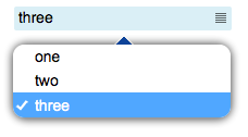
Select field that allows the user to select a value from a list. Clicking on the field will open a popup with a [[SelectPanel|select panel]]. | Select field that allows the user to select a value from a list. Clicking on the field will open a popup with a [[SelectPanel|select panel]]. | ||
Can be used with a [[submit]] button. | Can be used with a [[submit]] button. | ||
| − | |||
| − | |||
For a tutorial on using this object, see [[Working with Forms]] | For a tutorial on using this object, see [[Working with Forms]] | ||
Revision as of 11:16, 29 January 2014
Select field that allows the user to select a value from a list. Clicking on the field will open a popup with a select panel. Can be used with a submit button.
For a tutorial on using this object, see Working with Forms
Contents
Parameters
- id: the object's ID, used by UISets
- position: the object's position. Use the pixels or rows and columns coordinates format
- values: comma-separated list of values. When selecting an item from the list, the corresponding value from this list is sent
- labels: comma-separated list of labels corresponding to the values. If missing, values will be shown instead
- css: optional. Defines the CSS style for the input field
Syntax
(select!<id> <position>; <values>; <labels>; <css>)
E.g.
(select!myselect r1c1; 1,2,3; one,two,three;)
UI Attributes
Common attributes
| Name | Value | Description |
|---|---|---|
| pos | x<x>y<y> | Position specified as x/y coordinates. E.g. x-5y10 |
| visible | true | Default. Show the object |
| false | Hide the object | |
| blink | true | slow | Blink the object at a slow speed |
| fast | Blink the object at a fast speed | |
| false | Stop the blinking | |
| opacity | 0.0 ... 1.0 | Object opacity from 0 (not visible) to 1 (fully visible) |
| rotation | 0 ... 360 | Object rotation in degrees. Images are rotated around the center point, all other objects are rotated around the top left corner |
Field attributes
| Name | Value | Description |
|---|---|---|
| enabled | true | Field is enabled |
| false | Field is disabled | |
| autosend | true | Automatically sends the value on changes. It's the default behaviour when there are no submit objects on the page or in a parent container (if the field is inside a container). |
| false | Won't send the value on changes. It's the default behaviour when there's a submit object on the page or in a parent container. | |
| focus (deprecated, use page's focus attribute instead) | true | Focus the field. Only a single object should have this attribute at "true". |
| false | Reset focus | |
| rollback | true | Restores the previously saved value. |
| rollbackenabled | true | Automatically restores the previous value on an error (if the value isn't valid or the remote request resolved in an error). |
| false | Won't restore the value on errors. | |
| error | true | Manually shows an error feedback on the field (won't modify the current field value). |
| false | Hides the error visualization. |
Input attributes
| Name | Value | Description |
|---|---|---|
| value | string | Select value |
| values | comma-separated list of strings | Select values |
| labels | comma-separated list of strings | Select labels |
| multi | true | Can select multiple values. The value sent to the server will be a comma-separated list of the selected values |
| false | Default behaviour: only a single value can be selected | |
| notnull | true | Value can't be null |
| false | Default. Value can be null |
