Difference between revisions of "UserList"
| Line 23: | Line 23: | ||
*'''css''': optional. Defines the CSS style for the input field | *'''css''': optional. Defines the CSS style for the input field | ||
*'''repeat''': if "enabled", the command will be repeat every second | *'''repeat''': if "enabled", the command will be repeat every second | ||
| − | *'''template''': html template to be used for each item | + | *'''template''': optional, html template to be used for each item |
== Syntax == | == Syntax == | ||
Revision as of 17:53, 29 April 2015
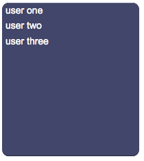
A panel with a list of items that work like user buttons, used to execute customized Java code or generate events for the EVENTS interpreter.
Pressing an item of the list, HSYCO calls the method:
- userCommand(String name, String param)
in the user.class class. HSYCO also executes all actions associated to the event:
- USER name=param
defined in EVENTS.
If the repeat parameter is "true", a long press will repeat the request every second.
For a tutorial on how to use this object see Working with User objects.
Contents
Parameters
- id: the object's ID, used by UISets
- name: name passed to the Java callback method and event in EVENTS
- parameters: comma-separated list of the parameters passed to the Java callback method and event in EVENTS
- labels: comma-separated list of labels corresponding to the parameters. If missing, parameters will be shown instead
- position: the object's position. Use the pixels or rows and columns coordinates format
- size: the panel's width and height
- css: optional. Defines the CSS style for the input field
- repeat: if "enabled", the command will be repeat every second
- template: optional, html template to be used for each item
Syntax
(userlist!<id> <name>; <parameters>; <labels>; <position>; <width>; <height>; <css>; <repeat>; <template>)
E.g.
(userlist!myuserlist name; p1,p2,p3; user one,user two,user three; r1c1; 220; 224; font-size:16px; enabled;)
Template
The template is HTML code that is applied to every item. An item's label is split into parts using the pipe character. These parts are replaced inside the template's code to form the final item's source.
%<n> (with n starting from 1) is used to include each part of the item's label inside the HTML. To avoid the % symbol to be replaced, use % instead.
E.g. If the template is:
<table><tr><td>%1</td><td>%2</td></table>and the labels are:
a|one,b|two
the resulting items will have the following html code:
<table><tr><td>a</td><td>one</td></table>and
<table><tr><td>b</td><td>two</td></table>UI Attributes
Common attributes
| Name | Value | Description |
|---|---|---|
| pos | x<x>y<y> | Position specified as x/y coordinates. E.g. x-5y10 |
| visible | true | Default. Show the object |
| false | Hide the object | |
| blink | true | slow | Blink the object at a slow speed |
| fast | Blink the object at a fast speed | |
| false | Stop the blinking | |
| opacity | 0.0 ... 1.0 | Object opacity from 0 (not visible) to 1 (fully visible) |
| rotation | 0 ... 360 | Object rotation in degrees. Images are rotated around the center point, all other objects are rotated around the top left corner |
UserList attributes
| Name | Value | Description |
|---|---|---|
| enabled | true | Object is enabled |
| false | Object is disabled | |
| focus | true | Focus the object. Only a single object should have this attribute at "true". |
| false | Reset focus | |
| error | true | Manually shows an error feedback on the panel. |
| false | Hides the error visualization. | |
| name | string | UserList name |
| parameters | comma-separated list of strings | Parameters |
| labels | comma-separated list of strings | UserList labels |
| width | number of pixels | Set the object's width |
| height | number of pixels | Set the object's height |
| panel | true | Show background panel |
| false | Hide background panel | |
| template | html code | Set the item's template |
