Difference between revisions of "SliderButton"
Jump to navigation
Jump to search
| Line 5: | Line 5: | ||
== Parameters == | == Parameters == | ||
| − | *''' | + | *'''address''': address passed to the Java callback method and event in EVENTS |
*'''position''': the object's position. Use the pixels or rows and columns coordinates format | *'''position''': the object's position. Use the pixels or rows and columns coordinates format | ||
*'''label''': the text label on the button. Can contain HTML tags | *'''label''': the text label on the button. Can contain HTML tags | ||
Latest revision as of 12:23, 22 June 2021
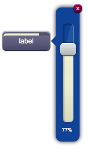
A button that opens a popup with a slider object.
Parameters
- address: address passed to the Java callback method and event in EVENTS
- position: the object's position. Use the pixels or rows and columns coordinates format
- label: the text label on the button. Can contain HTML tags
Syntax
(sliderbutton!<id> <address>; <position>; <label>)
E.g.
(sliderbutton!myslider slider1; x10y20; Label)
UI Attributes
Common attributes
| Name | Value | Description |
|---|---|---|
| pos | x<x>y<y> | Position specified as x/y coordinates. E.g. x-5y10 |
| visible | true | Default. Show the object |
| false | Hide the object | |
| blink | true | slow | Blink the object at a slow speed |
| fast | Blink the object at a fast speed | |
| false | Stop the blinking | |
| opacity | 0.0 ... 1.0 | Object opacity from 0 (not visible) to 1 (fully visible) |
| rotation | 0 ... 360 | Object rotation in degrees. Images are rotated around the center point, all other objects are rotated around the top left corner |
Slider attributes
| Name | Value | Description |
|---|---|---|
| value | 0-100 | Set the slider's value, from 0 to 100 |
| 0%-100% | Set the slider's value, from 0% to 100% | |
| off | Set the slider's value to 100 (on) or 0 (off) | |
| 0-n/n | Set the slider's value, specifying a base. E.g. 64/256 sets the slider to 25% |
